Advanced Plot Customization
plot_customization.RmdOverview
Certara.VPCResults uses functions from both the
tidyvpc and ggplot2 packages to parameterize
and plot Visual Predictive Checks (VPC). The resulting plot objects
generated from the Shiny GUI are of class ggplot, which
means we can use additional functions from the ggplot2
package to further customize our plot output inside RStudio.
Tag base VPC plot
To begin, we will use the example obs_data and
sim_data from the tidyvpc package.
First, we will need to subset our data by filtering
MDV == 0, which removes rows where both
DV == 0 and TIME == 0.
Next, we will launch the Shiny GUI using the function
vpcResultsUI(), passing the obs_data and
sim_data objects above to the observed and
simulated arguments in the function
vpcResultsUI().
library(Certara.VPCResults)

vpcResultsUI(observed = obs_data, simulated = sim_data)
Tagging VPC and downloading script
The images below demonstrate how to tag a plot and download the R script to reproduce.
From the “Inputs” container, select the columns in the data to use for the x and y variables (e.g., Time and DV).
Next, navigate to the “Controls” container and select from either binning or binless methods, then click “Plot”.
After generating the VPC plot and making any additional changes to the plot customization, click the blue circular button in the bottom right corner of the page, also known as the “Tag” button.
Once the plot has been “tagged” it will become available to view
inside the “Tagged” tab, where you may preview the tidyvpc
and ggplot2 code and download the R script to reproduce all
tagged VPC plots from RStudio.
Download R script from Shiny GUI
The following R script my_vpc_script.R was downloaded
from the “Tagged” tab in the Shiny GUI.
library(Certara.VPCResults)
library(ggplot2)
library(dplyr)
library(magrittr)
library(tidyvpc)


vpc <- observed(obs_data, x = TIME, y = DV) %>%
  simulated(sim_data, y = DV) %>%
  binless(optimize = TRUE, interval = c(0L, 7L)) %>%
  vpcstats(qpred = c(0.05, 0.5, 0.95), conf.level = 0.95, quantile.type = 6)

vpcPlot <- ggplot(vpc$stats, aes(x = x)) +
  geom_ribbon(aes(ymin = lo, ymax = hi, fill = qname, col = qname, group = qname), alpha = 0.1, col = NA) +
  geom_line(aes(y = md, col = qname, group = qname)) +
  geom_line(aes(y = y, linetype = qname), size = 1) +
  geom_point(data = vpc$obs[!(blq | alq)], aes(x = x, y = y), color = "#757D8F", size = 2L, shape = 16, alpha = 0.5, show.legend = FALSE) +
  scale_colour_manual(name = "Simulated Percentiles\nMedian (lines) 95% CI (areas)", breaks = c("q0.05", "q0.5", "q0.95"), values = c("#D63636", "#3648D6", "#D63636"), labels = c("5%", "50%", "95%")) +
  scale_fill_manual(name = "Simulated Percentiles\nMedian (lines) 95% CI (areas)", breaks = c("q0.05", "q0.5", "q0.95"), values = c("#D63636", "#3648D6", "#D63636"), labels = c("5%", "50%", "95%")) +
  scale_linetype_manual(name = "Observed Percentiles", breaks = c("q0.05", "q0.5", "q0.95"), values = c("dashed", "solid", "dashed"), labels = c("5%", "50%", "95%")) +
  guides(fill = guide_legend(order = 2), colour = guide_legend(order = 2), linetype = guide_legend(order = 1)) +
  ylab(sprintf("Observed/Simulated percentiles and associated %s%% CI", 100 * vpc$conf.level)) +
  xlab("\nTIME") +
  theme_certara()

vpcPlot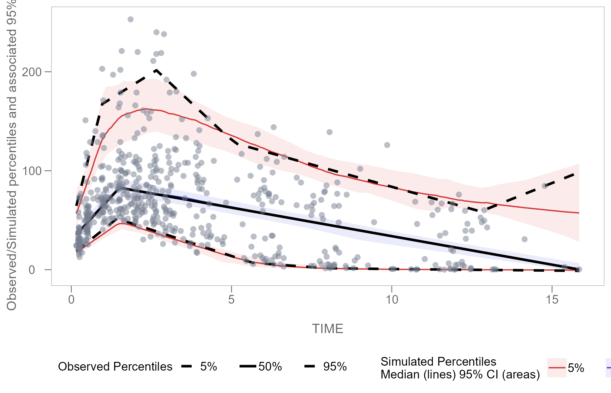
Plot customization
Now that we have our vpcPlot object (which is of class
ggplot) in our local R environment, we can apply further
plot customization using functions from ggplot2.
Adjust legend
We can edit the size and spacing of text in the legend using the
theme() argument.
library(ggplot2)

vpcPlot <- vpcPlot +
 theme(legend.position = "top",
       legend.title=element_text(size=8),
       legend.text=element_text(size=6),
       legend.key.width = unit(0.3, 'cm'))

vpcPlot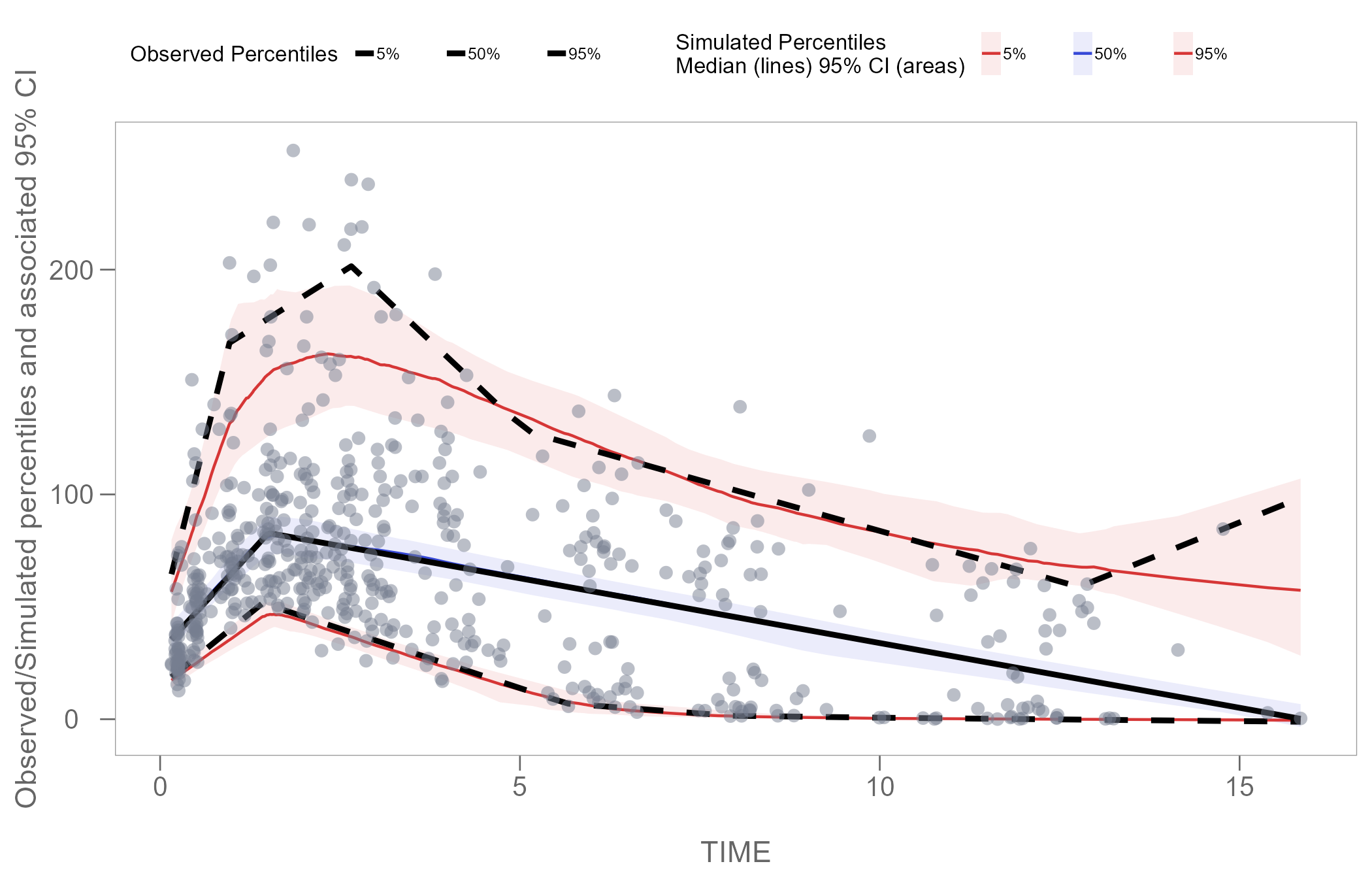
Zoom plot area
Using the function coord_cartesian() from the
ggplot2 package, we can zoom in on specific coordinates of
interest in our plot.
The example below shows how to set coordinates to display only time interval 1-5.
vpcPlot <- vpcPlot +
  coord_cartesian(xlim = c(1, 5))

vpcPlot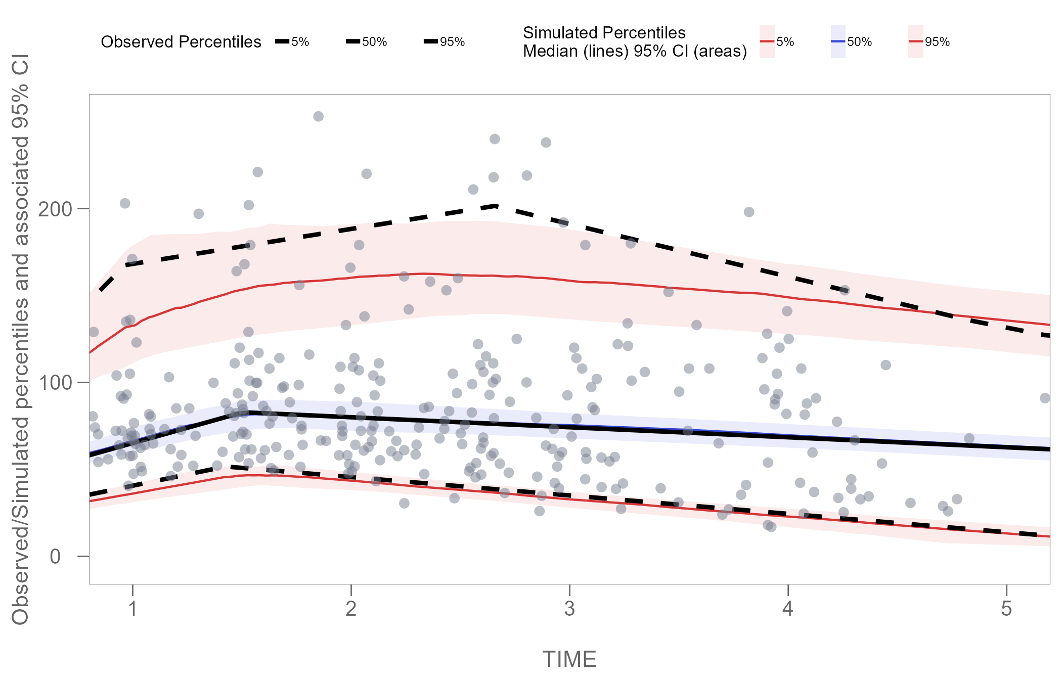
Note: Windows users with default graphics device engine specified
in RStudio may experience an issue where
the fill of the geom_ribbon() in the plot disappears when
combined with coord_cartesian(). The solution is to
install the ragg package and set default graphics device
engine in Rstudio to AGG.
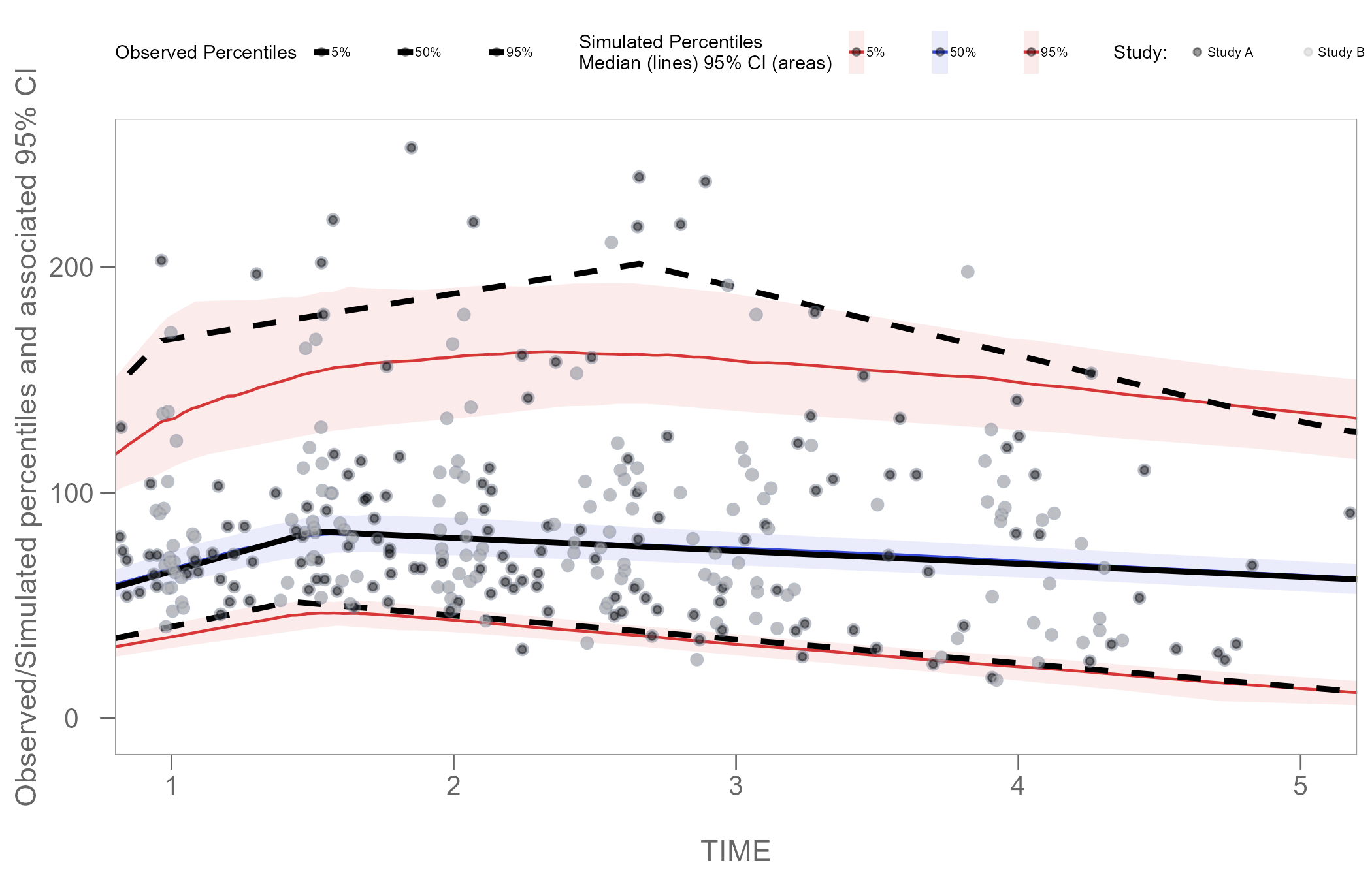
Color points by categorical variable
Instead of stratifying and faceting the resulting VPC plot by some categorical variable, we may choose to generate a single VPC plot and color the points to differentiate the unique values of the variable in the data.
In the plot below, we will color points using the STUDY
column in our obs_data.
The STUDY column is of class character and
has 2 unique values:
table(obs_data$STUDY)
#>
#> Study A Study B
#>     275     275
Using the code below, we will set the color of observations in
Study A to black, and observations in Study B
to grey. However, to achieve this, we must first add a new scale to our
vpcPlot using functions from the package
ggnewscale.
We will also edit the legend once again using the
theme() function, to ensure that our new Study
key displays correctly.
library(ggnewscale)

vpcPlot <- vpcPlot +
  new_scale_colour() +
  new_scale_fill() +
  geom_point(data = vpc$data,
             aes(x = TIME, y = DV, colour = factor(STUDY)),
             size = 1, alpha = 0.4, show.legend = T) +
  scale_colour_manual(name = "Study: ",
                      values = c("black", "grey"),
                      labels = c("Study A", "Study B")) +
   theme(legend.position = "top",
         legend.title=element_text(size=7),
         legend.text=element_text(size=5),
         legend.key.width = unit(0.25, 'cm'),
         legend.spacing.x = unit(0.025, 'cm'),
         legend.justification = c(0, 0),
         legend.margin = margin(c(5, 5, 5, 0)))

vpcPlot